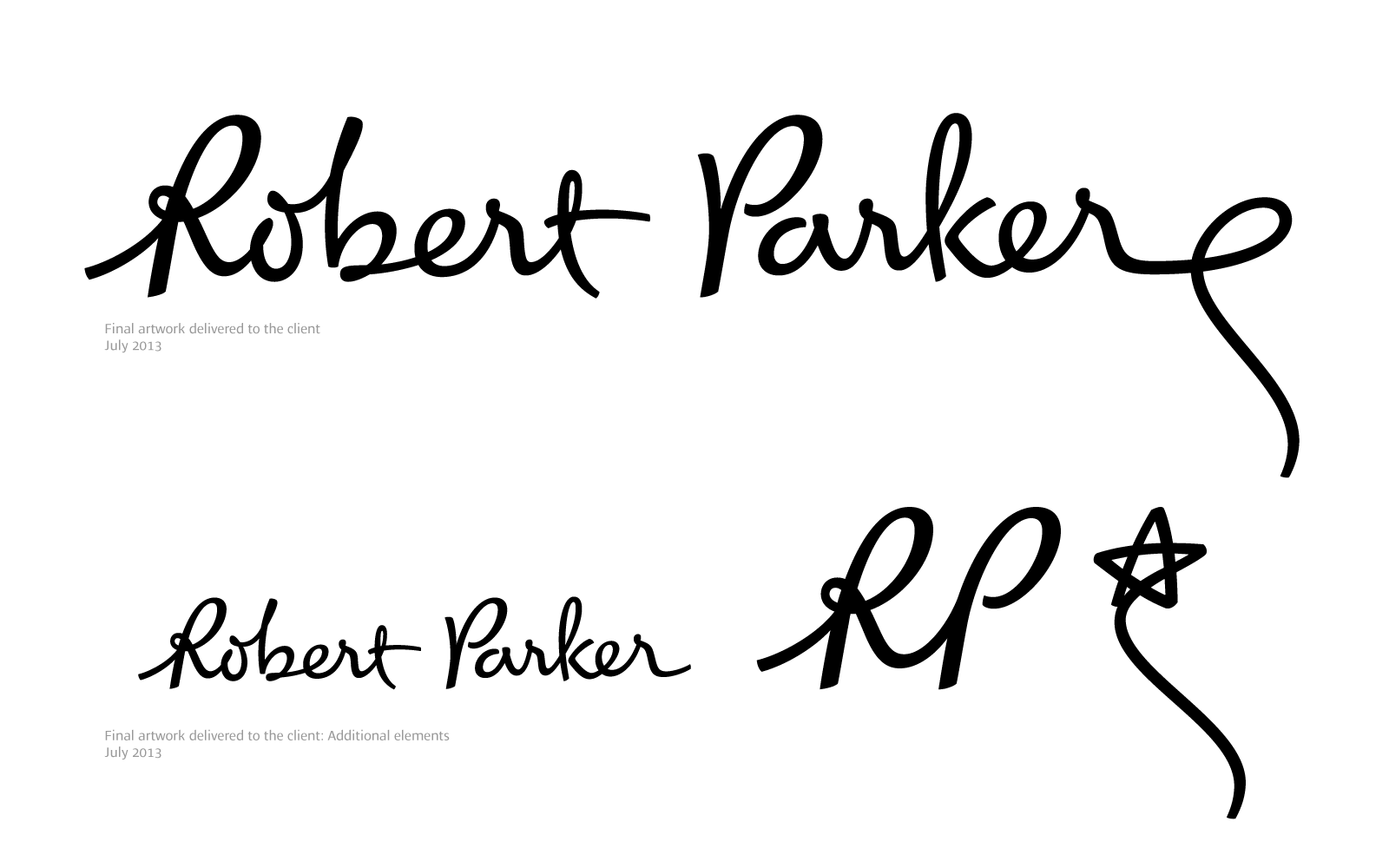
While the world of luxury and wine awaits the debut of the magazine 100 Points by Robert Parker, I can't help but wonder if a logotype project by ZeCraft was part of a redesign to Parker's signature meant for this new project. You can view the orignal logo that adorns the masthead of The Wine Advocate to compare.
ZeCraft Co-Founder Jean François Porchez has the details of the (ultimately rejected) project on his site, Porchez.com. It's a fascinating look into how a graphic designer works. And Porchez seems like one really interesting, passionate, and dedicated guy. In an interview with Create and Rotate, he reveals, "I can’t survive without a typeface design project on the way. It's my oxygen." Also, if he could travel in time, where would Porchez go? "An impossible remix of Romain empire, Italian and French Renaissance period, 30′s in New York and Paris, 60′s swinging London." Follow him on Twitter for more of his thoughts on design and beyond.
So how many points do you think Parker gave this logotype?