Top 25 Wine Labels
As someone who spent a decade working in the retail wine business, I became somewhat obsessed with labels. Part of merchandising a store or a department is having bottles (and boxes) stacked up high with enough visual appeal to get people to stop, look, and put one (or more) in their basket. Was it important that the juice inside was as appealing as the artwork and design outside? Uh, yeah. Absolutely.
But one of the things I love about Pinterest is that I can indulge my label lust without having to worry about price, availability, or feasibility. If I see a label I like, I can just admire it and pin away. Am I ever going to get to know what it tastes like? No matter. I simply enjoy seeing a wine label used as a canvas for creativity. Cool fonts, elegant details, arresting colors and patterns, a touch of humor and whimsy? All employed by creative designers. And sometimes you'll even find a connect-the-dots label or one that's dropping (literal) F-bombs.
What follows are 25 labels that really caught my eye. Some are mysterious as to their origin and inspiration, others have the story from the designers themselves. There's a saying that "we eat with our eyes". Though I'm not implying that you should eat a wine label (please do not), the best ones are evocative of what you can expect when you pour a glass and take that first sip. Wine labels set atmosphere and shape expectations.
Enjoy the slide show. And let me know if you agree or disagree with my picks. What would make your Top 25?
Follow Grape Collective on Pinterest.
Follow Grape Collective 's board 25 Best Wine Label Designs on Pinterest.

Malvarelo-lo
Malvarel-lo is a mashup of Malvasia and Xarel-lo from producer Torelló. The design by Enric Aquilera Associados captures the mashing of the grapes and production of the wine in a most whimsical and fanciful manner.
http://www.pinterest.com/pin/551479916844140136/

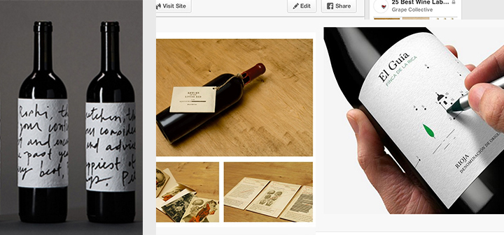
Handwriting
The “handwriting” on these wine labels, along with the textured paper of the label, makes it feel like you just got a letter in the mail. I'm nostalgic for the pre-email days.
http://www.pinterest.com/pin/551479916844140105/

ripping pun
Now this is what I call a holiday card. I also like the “ripping pun”. Created by Design by Pidgeon.
http://www.pinterest.com/pin/551479916844140068/

Mikotsuru
This sake by Mikotsuru does have a lovely label, but this is all about the cat.
http://www.pinterest.com/pin/551479916844139964/

Alphabetical
The black and white label keeps the focus on the font and surrounding design. This wine comes from South Africa’s Western Cape, where, as the owners of Alphabetical say, “the winemakers surf and the surfers make wine.”
http://www.pinterest.com/pin/551479916844139927/

Anthony's Garage Winery
If you name your winery Anthony's Garage Winery, which is housed in a former tractor shop, why not have packaging inspired by what you’d find there? The can vessel for these fruit brandies gets my attention but I’m equally drawn to the labels.
http://www.pinterest.com/pin/551479916844139874/

Crochet
I have no idea how to crochet, but after gazing at this label and surrounding packaging designed by Rita Rivotti I’d be willing to learn.
http://www.pinterest.com/pin/551479916844140000/

Finca de la Rica
Make sure the cork is in the bottle or it’s empty before you tilt this bottle of Rioja from Finca de la Rica to connect the dots.
http://www.pinterest.com/pin/551479916844139858/

Saramago
The story behind this wine from Behance: ““Wine tribute to Portuguese writer José Saramago. Produced and developed in Lanzarote where the writer took up residence after a dispute with the government of Portugal by the publication of his book "The Gospel According to Jesus", which questions the doctrines and dogmas of the Christian religion."
"It is in this work where is based the design for the series of three wines, red, white and rose.”
http://www.pinterest.com/pin/551479916844140037/

Delhaize
A trio of wines part of a global lineup produced for Belgian supermarket chain Delhaize. Corks are fashioned into an image symbolic of the wine’s country of origin.
http://www.pinterest.com/pin/551479916844139992/

Vi Novell
For the 2010 vintage of Celler el Masroig’s "Vi Novell" (“New Wine”), a carbonically macerated blend of Grenache and Carignan, design firm Atipus was inspired by local festival posters printed with movable wooden types.
http://www.pinterest.com/pin/551479916844139951/

Dirty Pure Project
Warning: The Dirty Pure Project drops F bombs.
http://www.pinterest.com/pin/551479916844139865/

Pandora's Amphora
Design by Jeremy D.V. Boyd and wine by Ducks in a Row Winemakers. Get the story behind the label and the wine. “That’s Amphorae!”
http://www.pinterest.com/pin/551479916844139974/

Leaflet
From DBK Design: “The Leaflet brand is the result of ‘mixing’ wine and paper. Both products have a strong relationship with wood (wood barrels and wood pulp.) This label design blends that relationship by merging a grape leaf with the trunk of a tree. The die-cut leaf and the screen printed text break free from traditional sticker labels.”
http://www.pinterest.com/pin/551479916844139922/

Ashbourne Sauvignon Blanc
The fascinating story behind the design of this label by Pearly Yon:
“I was briefed to design a label that incorporated elements from the flora and fauna of the Hemel-en-Aarde Valley (where the wine is made) and aspects of both the family crests, but I had to bring them together in a Belle Époque style.
The colours were inspired by the farm and it's surroundings. The blue/green came from the faded inside wall paint of an old abandoned farm cottage in the valley. The vivid and more faded pink came from the inside colour of a certain type of mussel shell that's found on the beaches of Walker Bay. The orange came from the small, rare Arum Lily frog that is found on the property.
Every element on the label was considered by the Hamilton Russell family, who pride themselves on family ownership and hands-on involvement.
I was there to see the first label roll off the press which was as exciting for the printer as it was for me. It was quite a complex label to print as it is made up of 5 colours, a foil, and a spot varnish.”

Brazilian Sparkling Wine by Miolo
Brazilian sparkling wine by Miolo; design by Ofifacil.
http://www.pinterest.com/pin/551479916844139970/

Meteor Merlot for White Fences Vineyard in Virginia
WORK Labs designed this Meteor Merlot for White Fences Vineyard in Virginia. Has me dreaming of starry nights with a glass of wine.
http://www.pinterest.com/pin/551479916844139889/

Figula Olaszrizling 2013 by Peltan Brosz Roland
Figula Olaszrizling 2013 by Peltan Brosz Roland. The story from Behance:
“Our work intends to highlight the importance of the land and the vine as a plant on which a great emphasis was placed on the description of the competition. The focus is mainly on the 35-year-old roots, which enmesh the bottle defining a circle that marks the location of the typography as the nature outlines the wine.
To do this, we have created custom typography and drawing. The simplicity of the label and the lacy drawing help each other, the Olaszrizling playfully emphasized as the title of the vine, the vineyard selection (dűlőválogatás) is marked between two snail houses from the illustration. The snail is a perfect and living form that appears on the label, which symbolizes the good and healthy living soil. The root on the outside wrapping is gold, which creates a feeling of quality and aesthetic effect and on the inside gold is the color of the wine and the roots are black.
The wine label designed for the Cégér a jó bornak creative competition was selected amongst the best 10.”
http://www.pinterest.com/pin/551479916844139889/

Helderberg Winery
Design firm Fanakalo is behind this wrap-around label that looks really cool when you line up three bottles together. Also you can see the textured detail on the white portion of the label when you visit the firm's website.
http://www.pinterest.com/pin/551479916844139894/

B Meadery and Vineyard
As Designer Joli Glantz explains, “The importance of honey to the meadery is shown through this playful yet refined mark. The challenge for this bottle was to design an approachable label to introduce mead to mainstream shoppers on grocery store shelves. The most prominent flavor is visually represented on a simple die-cut label.” (Note: was unable to find any information about B Meadery and Vineyard online.)
http://www.pinterest.com/pin/551479916844140057/

Lanesdowne Vineyard
Tass Gyenes Design not only knocks the label design for Lanesdowne Vineyard out of the park, but head to their website to check out the business cards and even the packing tape for cases that give the brand have a unified, consistent image. And, yes, they did do a run of 1160 individually numbered bottles of their 2009 Sauvignon Blanc, Lanesdowne Vineyard’s first official release.
http://www.pinterest.com/pin/551479916844139908/

Wiston Estate
From Wiston Estate’s website: “The label was inspired by the story of two families coming together. It combines the colour and intensity of Pip’s South African nature with Harry’s family heritage and English design.
The intricate detail replicates the plasterwork of the Great Hall at Wiston House, commissioned by Sir Charles Goring in the mid-18th century, with the eagle carrying the ribbon of grapes and flowers.
The Wiston font has been inspired by the wooden archive boxes dating from the late 19th century.”
http://www.pinterest.com/pin/551479916844139993/

96 Designs Using Wine
What do you do with 96 cases of Grenache? You create 96 labels, each painted with wine. Be sure to watch the behind-the-scenes video of Passport Design's project.
http://www.pinterest.com/pin/551479916844140075/

RedHeads Studio
Mash Design tells the story behind this label for Australian winery RedHeads Studio on the dieline:
“This was a complex fine wine with no listed age; a mysterious and intriguing wine. To compliment this the nature of the product, Mash developed a concept to create a small pack containing missing and/or suppressed crime files implying the existence of the living dead in and around the vineyards. With use of disturbing illustrations and fascinating old photos on a toothy uncoated paper the concept was bought to life. A slip knot with old twine and a deep red wax dipped bottle went with the old crime file folder to create one of our favorite wine packaging pieces."
http://www.pinterest.com/pin/551479916844140068/

Cantina Colli Ripani
“Wine is Art” states the websites of Cantina Colli Ripani. I always swoon when a wine with a label like this had a case box to match.
This is my kind of six-pack.
http://www.pinterest.com/pin/551479916844140123/